
Over the past few years, mobile internet usage has surged, making it necessary for you to optimize your blog for mobile devices. In this guide, you will learn effective strategies to enhance user experience, improve loading speed, and ensure your content is easily accessible on smartphones and tablets. By implementing these techniques, you’ll not only attract a broader audience but also keep your readers engaged and satisfied with their mobile browsing experience.

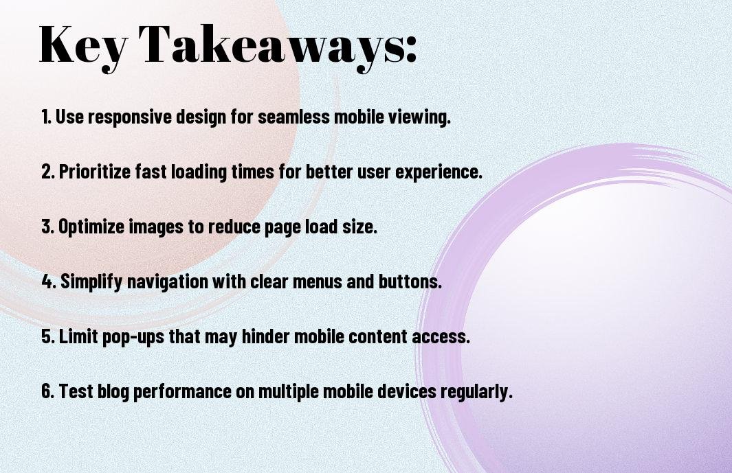
Key Takeaways:
- Responsive Design: Ensure your blog adopts a responsive design that automatically adjusts to various screen sizes.
- Fast Loading Speed: Optimize images and use minimal scripts to enhance your site’s loading speed.
- Readable Fonts: Choose font sizes and styles that are easy to read on smaller screens.
- Touch-Friendly Navigation: Design navigation that is simple and touch-friendly for users on mobile devices.
- Meta Tags: Utilize proper meta tags for mobile devices, especially viewport settings for better scaling.
- Test Across Devices: Regularly test your blog on various mobile devices to ensure a consistent user experience.
- Content Optimization: Prioritize content that is mobile-friendly and provides quick access to necessary information.
Quick recommendation: Our blog is filled with useful tips to help you succeed. If you are seeking a more comprehensive training program, we recommend the 72 Hour Challenge.
Understanding Mobile Traffic
For bloggers, understanding mobile traffic is vital as it constitutes a significant portion of overall website visits. As more users access content on smartphones and tablets, you need to recognize the trends driving this shift. By comprehending how and when your audience engages with your blog on mobile devices, you can tailor your strategies to enhance user experience and retain readers effectively.
Importance of Mobile Optimization
To succeed in the competitive blogging landscape, optimizing your site for mobile is paramount. With an increasing number of users browsing on handheld devices, a seamless mobile experience can boost user engagement, lower bounce rates, and improve search engine rankings. By prioritizing mobile optimization, you ensure your content reaches a wider audience and is accessible anytime, anywhere.
Analyzing Mobile User Behavior
An effective way to optimize your blog is by analyzing mobile user behavior. Understanding how visitors interact with your content on mobile can help you refine your approach, ensuring you meet their needs and preferences. Tracking metrics like page load time, scrolling behavior, and time spent on pages will provide insights that drive better user experience on mobile devices.
Also, considering factors such as device type, screen size, and user demographics will give you a rounded view of your mobile audience. By utilizing analytics tools, you can identify trends and patterns specific to mobile users, enabling you to create tailored content and features that resonate with them. This attention to detail can significantly enhance user satisfaction and retention rates on your blog.
Responsive Design Principles
While creating a mobile-optimized blog, it’s imperative to incorporate responsive design principles. This approach ensures that your content adjusts seamlessly to various screen sizes, providing an optimal user experience. By focusing on flexibility and adaptability, you can enhance your site’s usability across devices, which is vital in today’s mobile-centric digital landscape.
Fluid Grids and Layouts
Against traditional fixed layouts, fluid grids help you achieve a more adaptable design. By using relative units like percentages instead of fixed pixels, your blog’s layout will resize gracefully across different screen sizes, ensuring that your content remains accessible and visually appealing, regardless of the device being used.
Quick recommendation: Our blog is filled with useful tips to help you succeed. If you are seeking a more comprehensive training program, we recommend the 72 Hour Challenge.
Flexible Images and Media
Designing with flexible images and media ensures that all visual elements adjust accordingly, maintaining their quality and aspect ratios on various devices. This practice enhances the overall aesthetic of your blog and contributes to a cohesive experience for visitors.
Even if you have stunning visuals, they can negatively impact the user experience if they don’t resize properly. Use CSS techniques such as max-width: 100%; to prevent images from exceeding their containing elements, ensuring they fit well within the layout. Additionally, consider using responsive image formats like WebP or incorporating media queries for different screen resolutions. This way, you provide high-quality visuals without sacrificing loading times or performance on mobile devices.
Optimizing Page Speed
Once again, page speed is a key factor in providing an excellent mobile experience. A slow-loading site can frustrate users and lead to higher bounce rates. To keep visitors engaged, focus on optimizing the elements of your blog, such as images, scripts, and overall design to ensure they load quickly on mobile devices. Your aim should be to create a seamless experience that keeps readers coming back for more.
Tools to Measure Speed
For measuring your blog’s speed, various tools can provide valuable insights. Platforms like Google PageSpeed Insights, GTmetrix, and Pingdom allow you to analyze your site’s loading times, identify bottlenecks, and receive recommendations tailored to enhance mobile performance. Utilize these tools regularly to monitor changes and make data-driven improvements.
Techniques to Enhance Performance
Enhance your blog’s performance by employing several effective techniques. Start by optimizing images using appropriate formats and compression without sacrificing quality. Minimize HTTP requests by reducing the number of elements on your pages, and leverage browser caching to store frequently accessed resources. Additionally, consider implementing a Content Delivery Network (CDN) to speed up content delivery across different geographical locations and improve overall user experience.
Performance can significantly improve with clean coding practices. Ensure your CSS and JavaScript files are minified to reduce their size while optimizing your HTML layout for faster rendering. Prioritize loading critical resources to enhance Above-The-Fold content display, keeping visitors engaged immediately. By focusing on these strategies, your blog can load faster on mobile devices, ensuring a positive experience for your audience.
Simplifying Navigation
Many users navigate blogs on their mobile devices, making simplified navigation necessary for a positive experience. Ensure your layout is streamlined and intuitive to facilitate effortless browsing. Prioritize important links and minimize clutter, allowing your visitors to focus on your content without distractions.
Mobile-Friendly Menus
An effective mobile-friendly menu is compact yet comprehensive. Utilize dropdowns or icons to conserve space while clearly categorizing your content. This design allows users to easily find what they are looking for without excessive scrolling or confusion.
Minimizing Clicks to Content
Content accessibility can significantly impact user engagement. Reducing the number of clicks it takes to reach your key articles or information keeps users interested and encourages them to explore more of your blog.
Hence, aim to place your most valuable content just a click away. Use strategic placement for popular articles and make them easy to access from your homepage. Offering a search bar also allows users to quickly find specific topics, enhancing their overall experience on your mobile blog.
Content Strategies for Mobile
All successful mobile optimization strategies focus on delivering a seamless user experience. To effectively engage your audience on mobile devices, you need to adapt your content to meet their unique needs. This includes refining your text for readability and ensuring that vital information is easily accessible. With the increasing use of smartphones, your blog’s content must be tailored for quick consumption to keep readers engaged and returning for more.
Shorter Paragraphs and Sentences
Against traditional writing methods, mobile content demands shorter paragraphs and sentences. On smaller screens, expansive writing can overwhelm readers and deter them from continuing. By breaking your content into digestible chunks, you enhance readability, allowing your audience to absorb information quickly without losing interest.
Using Bullet Points and Lists
Mobile-friendly content is best displayed in easy-to-scan formats. You can significantly improve the user experience by incorporating bullet points and lists in your blog posts. These tools help distill complex information into straightforward, digestible pieces, making it simpler for readers to grasp key points without excessive scrolling or effort.
Shorter text blocks like bullet points and lists not only improve clarity but also enhance visual appeal. On mobile devices, where screen real estate is limited, concise formatting draws attention and keeps your content organized. By using these tactics, you allow your readers to find vital information quickly, increasing the likelihood that they will engage further with your content.
Testing and Iteration
Now that you’ve optimized your blog for mobile, it’s imperative to test its performance regularly. This ongoing process allows you to identify any issues that arise due to updates or changes in technology. By gathering user feedback and analyzing data, you can make necessary adjustments, ensuring your mobile site remains user-friendly and effective. Iteration is key to staying ahead in the ever-evolving digital landscape.
Tools for Testing Mobile Optimization
An array of tools exists to help you assess your blog’s mobile optimization. Google’s Mobile-Friendly Test lets you verify if your site meets mobile criteria, while tools like GTmetrix and PageSpeed Insights analyze load times and performance. Additionally, browser developer tools allow for responsive design testing across various devices. Leverage these tools to maintain a seamless mobile experience.
Continuous Improvement Strategies
One effective approach to continuous improvement is to implement regular checks on your mobile blog’s performance and user engagement metrics. Analyze user behaviors through tracking tools and adjust your content, layout, or design based on these insights. Testing different elements like call-to-action buttons and images can significantly influence user interaction.
Optimization is an ongoing journey. By conducting A/B tests, you can determine which designs or content layouts resonate best with your audience. Adjustments based on user feedback not only enhance the user experience but also improve your blog’s overall performance. Staying updated on mobile technology trends and user preferences will further help you adapt and refine your approach, ensuring your blog remains engaging and effective for mobile users.
To wrap up
Upon reflecting on how to optimize your blog for mobile, you should consider adopting responsive design, simplifying navigation, and ensuring fast load times. By focusing on these elements, you enhance user experience and accessibility, leading to better engagement and retention. Additionally, test your blog on various devices and screen sizes to identify areas for improvement. Implementing these strategies will position your content to reach a wider audience and potentially boost your blog’s visibility in search rankings.
Quick recommendation: Our blog is filled with useful tips to help you succeed. If you are seeking a more comprehensive training program, we recommend the 72 Hour Challenge.